
Virgin Media O2
Comms Design
Delivering clear, consistent and engaging design across internal and external communications for a major UK telecommunications brand.
Background
Virgin Media O2 operates at scale, with a constant flow of communications across internal teams, stakeholders and customers.
Design plays a critical role in ensuring information is not only visually engaging, but also clear, accessible and aligned with the brand’s identity.
Working within an established design system, the challenge was to maintain consistency while adapting to a wide range of communication needs.
The Challenge
Design communications that:
Translate complex information into clear, digestible visuals
Maintain consistency across multiple channels and formats
Align with brand guidelines while remaining flexible
Deliver at pace in a fast-moving corporate environment
The work needed to balance clarity, speed and brand integrity across a high volume of outputs.
The Approach
I created a series of animations and videos to compliment the event including a national tour schedule and a Gig1 rollout celebration video
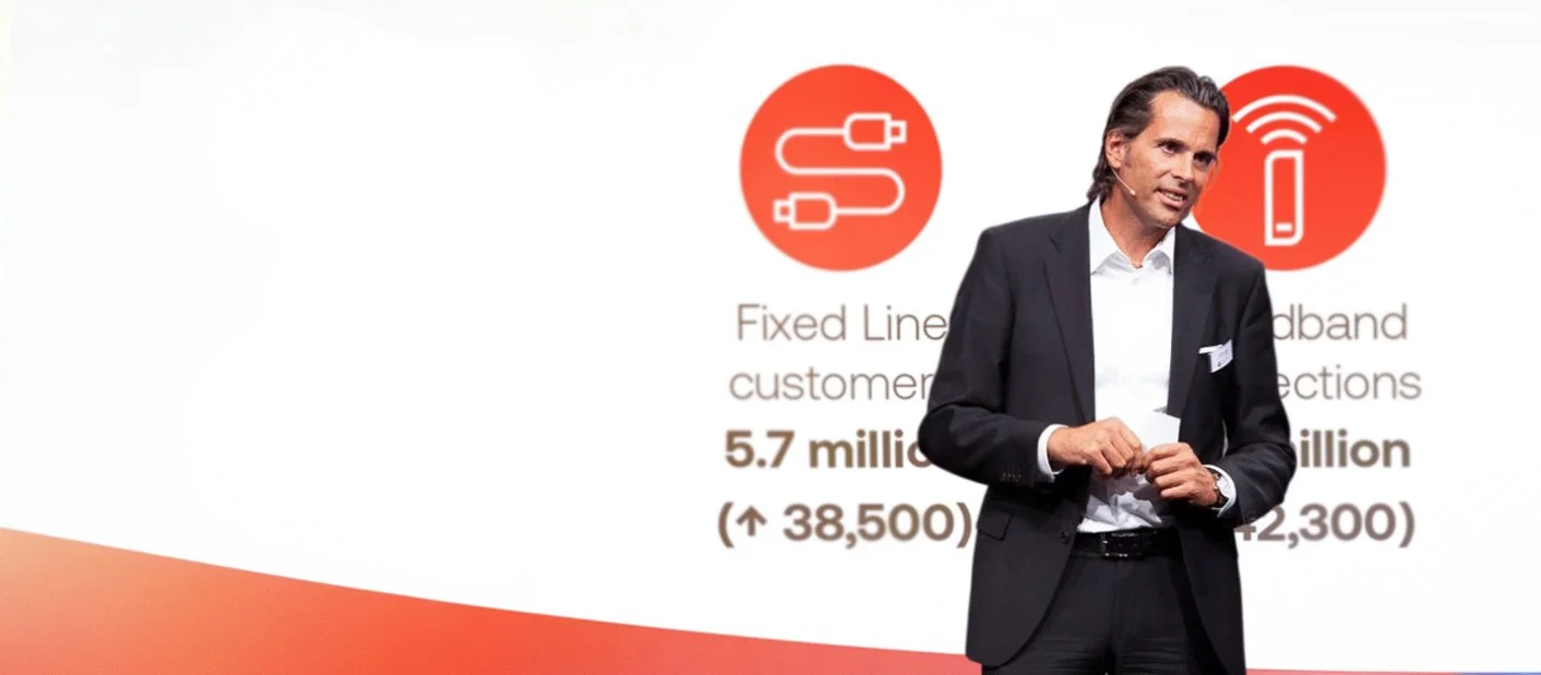
Deck slides were clean, minimal and impactful - the focus being on the words of the presenter
I focused on creating structured, easy-to-navigate layouts that prioritised clarity and hierarchy.
This included:
Using typography and spacing to guide users through information
Simplifying complex content into clear visual formats
Applying consistent design patterns across presentations, digital assets and internal communications
The goal was to create work that felt coherent, efficient and on-brand, while still being engaging and easy to understand.
Outcome
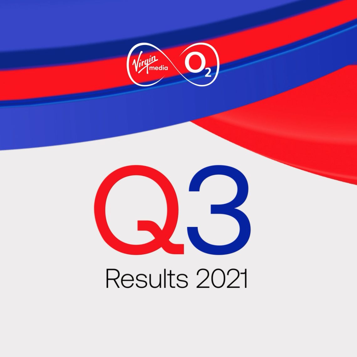
An infographic was created for investors and I designed an investor website to host all Virgin Media O2 results content and information
The creative was rolled out across a wide range of applications, supporting a national campaign that connected NHS workers with live events during a critical time.
The work helped create a recognisable and cohesive identity across multiple venues and communications, reinforcing the initiative’s message of appreciation and support.
This project highlighted the importance of clarity and restraint when designing for real-world impact.
Rather than overcomplicating the visual language, the focus was on creating something direct, adaptable and meaningful — ensuring the message remained front and centre across every touchpoint.